


AXA XL.
AXA is one of the largest insurance firms in the world. My team came in to help design and create a new product for users to prevent and mitigate risk.
This was a five month project with a team consisting of myself, a Service Designer & a Product Owner.
We were brought into the project with no idea what the final solution would be.
.png)

.png)
user experience • PRoduct • USER INTERFACE • Strategic thinker • Creative Problem Solver • Creative Direction • Strategic thinker •
AXA brought us in having no idea what the final product, service or solution would be.
This was an interesting problem to have as there was no one where to look for any type of inspiration.
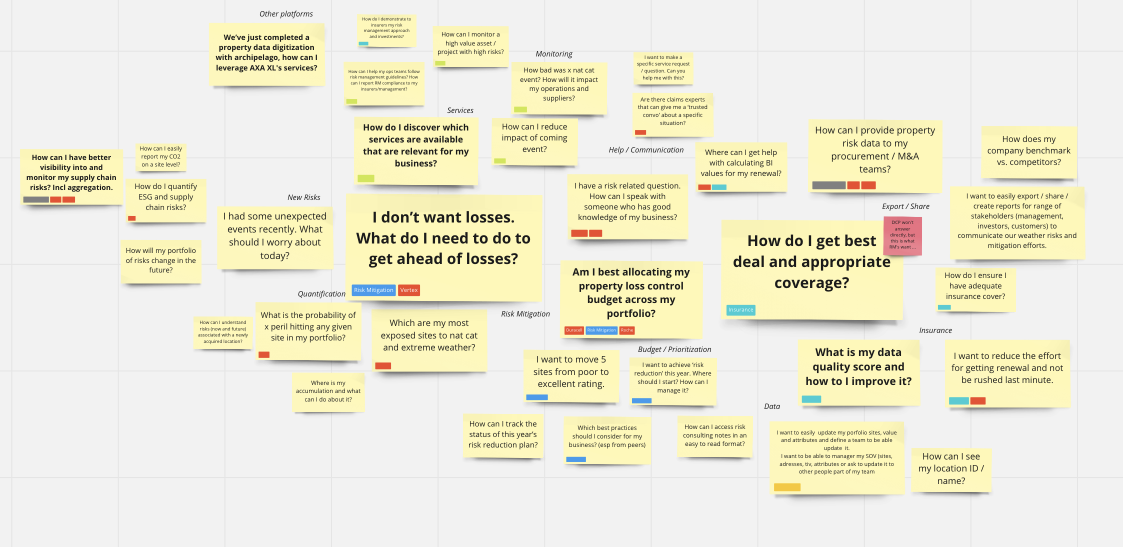
The first step was to run a workshop with the client, this was a very important workshop as we had nothing to go off at this point.

Early ideation


Early functionality


We knew the user would predominately be someone at work, AKA on a desktop.
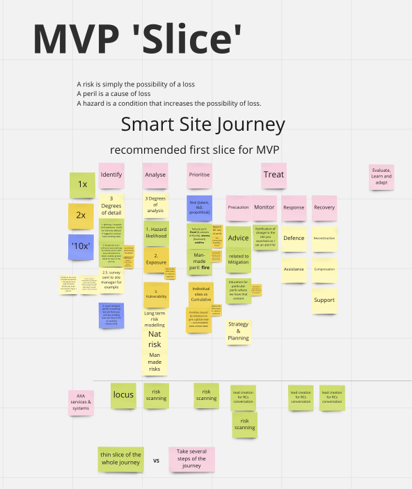
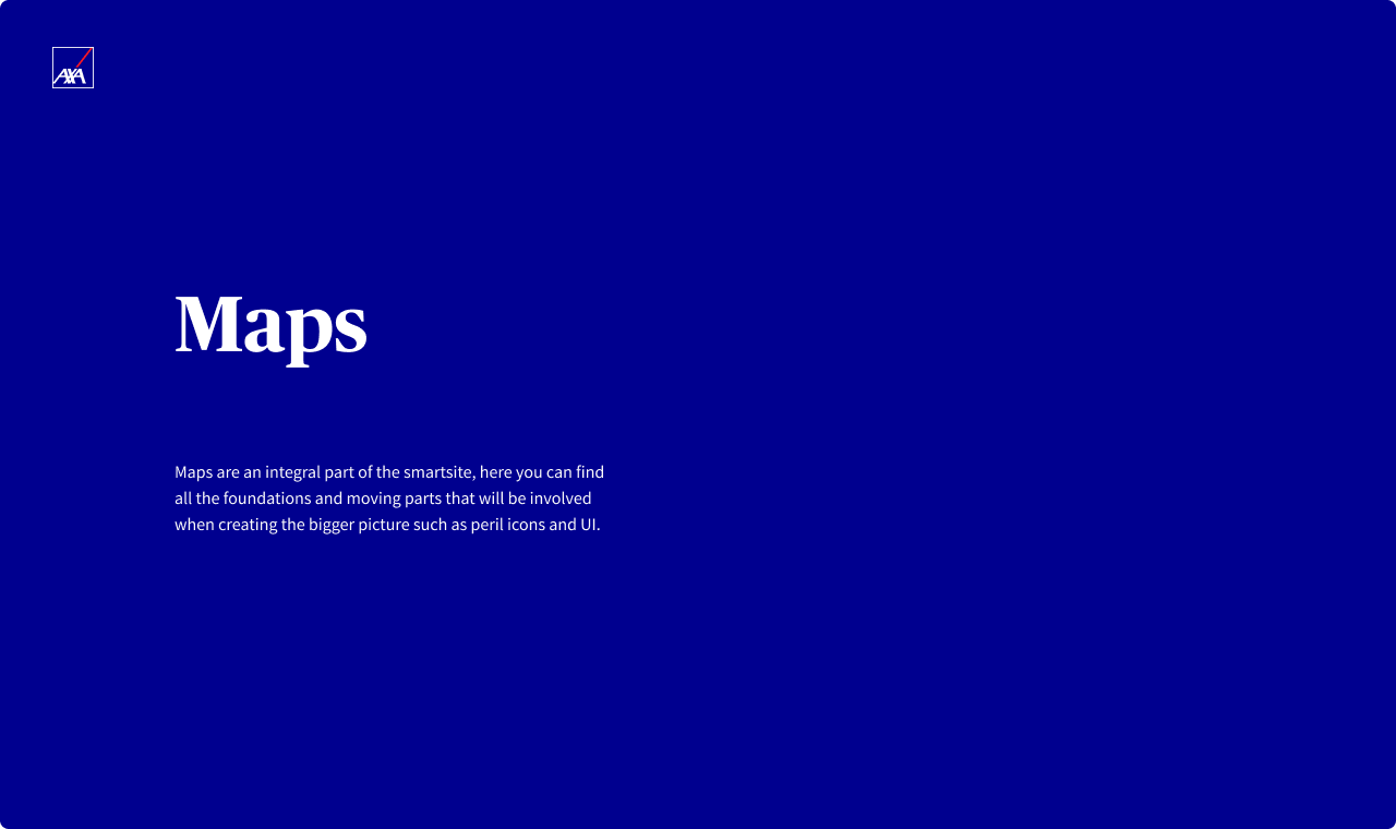
We also learned the main functions of this product would be; to monitor their sites, be alerted when a live event was happening, to give out mitigation advice if a live event was affecting their site & then how to prevent this risk in the future.
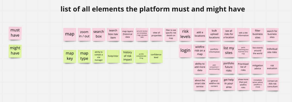
This gave us some early ideas for features such as maps, property lists, risk scores, mitigation advice etc.
.png)
USER FLOWS & WIREFRAMES

USER FLOWS
We'd been given the green light from AXA so the first step was the create some user flows.
This helped us work out where certain features would be and how the product would function.
WIREFRAME EXPLORATION
Once the user flow, features, pages and all the page content was mapped out, we began to look at some very early wireframes of what this concept/platform might possibly look like content-wise.

MOODBOARDS & UI EXPLORATION
THE 'SMARTSITE' IS BORN
We named our product the 'Smartsite' - it would be a web app as it would be used by Risk Managers in their 9-5.
Due to the uniqueness of this solution, it was difficult to find inspiration elsewhere.
THINKING 'SMART'
Looking at competitors was useless as there were none so I decided to think outside of the box.
I created moodboards of anything to do with weather, any dashboard or just anything that would have a map as I know these would be featured.
Round 1 - Versions 3 & 4


We spoke to around 10 potential users AXA had found for us ranging from Risk Managers to Property Owners.
The first 30/40 minutes were about what the user does on a day-to-day basis at work, then we asked multiple questions about what they'd like to see on a platform like this.
Finally we showed them our early concepts, asking them what they think as we go.


After the first round of research, there were a few aspects that clearly needed fixing.
Confusion over colours came up multiple times as AXA's colours are red & blue.
The two most used perils are wildfire and floods which are also red/orange & blue.
Then when we talk about risk, red would usually be associated with 'high risk'...
It's clear there needed to be more thought put into this.
COLOUR ISSUES
Now I had to try and improve our first attempt designs for the next round of user testing.
We added in a map key and iconography to the perils to help the user differentiate between risks & hazards.
WAR OF THE WORDS
Coming from a non-insurance background, we didn't have knowledge of the area.
This lead to confusion, especially when using terms & phrases in the insurance 'language'.
Risks vs live events vs perils
.png)
We also decided to step away from the desktop app, three panel version to a new idea that might be more familiar to the user.
We now had two columns; the left for information and right, wider one with the map/site.

Version 3 / version 4

The two versions were quite different.
V3 had tabs of 'Dashboard', 'Search' & 'Explore' whereas V4 had 'Live', 'My Risk' & 'My Data'.
'Search' on V3 showed all the live events around the world based on an early assumption whereas V4 only showed events affecting the users site, something we picked up from interviews.
In V3, to add a new site you have to go through some modal questions before it's added to your sites.
In V4 you can just save a site & add the details later; we decided this after finding out some users had over 3000 sites.
There were also quite a few design changes so it was safe to say the testing would prove some interesting results.
CH-ch-changes...
RESEARCH SMARTER
We created a database in Notion that collated all the data from the Figjam sticky notes and sorted them into sortable lists.
Property Search
We could sort by 'screen' or 'emerging insight' - this made the research a lot easier to handle as we has so much information.
It made it much clearer to see insights that were brought up repeatedly & therefore, the most important insights.
We were definitely close to the coming up with an MVP with Version 4 but there were some important insights we needed to digest after the last round of testing.
We had found out the correct industry language to use but this wasn't consistent with all users.
Long term risk & live events
We had found out that 'risk' is usually referring to something in the future but we wanted to make it as clear as possible by calling them 'Long-term site risks' & 'Live events'.
clear as day
After 2/3 rounds of testing, the colours were still proving to be an issue.
We decided to go all out and use words, icons & colours to make it as clear as we possibly could.
& the most important part...
.png)
Whilst people loved the map idea & that is an important overview page, the vast majority of interviewees told us that they would already know if a live event was happening near one of their sites.
What they really wanted to do was find out what long-term risks a site has, how they can prevent this in the future, what to do when the site is at risk etc.
So we removed 'Mitigation advice' as it was more of an after-thought and added tabs to site level pages. These tabs were for 'Insights', 'Actions' & 'Services'.

The missing link! hopefully...
.png)
The participants thought the new risk overview was a great idea.
This round was very interesting because it got a lot of the users thinking creatively, telling us what would be 'really cool' or 'extremely useful' in these new tabs.
These ideas were great to hear but were out of scope for the MVP, in terms of what we had created, it was definitely deemed as successful from the final round of testing.
Mission successful


More projects.


