


ui/ux & design system
AXA XL Smartsite

back to projects
AXA XL
SMARTSITE & DESIGN SYSTEM
AXA is one of the largest insurance firms in the world. Foolproof were brought on to help design and create a new concept for users to prevent and mitigate risk.
ROLE
This project included a Product Owner, a Principal Service Designer & I handled the UI on my own along with helping out extensively with the UX throughout the whole process and problem solving in general with the client.
This is a HUGE project page so if you are looking for anything specific please use the navigation on the left!
INDUSTRY
Insurance
SKILLS
UX
UI
Prototyping
Wireframing
Design Systems
Component Libraries
PROGRAMMES
Figma
Insurance
SKILLS
UX
UI
Prototyping
Wireframing
Design Systems
Component Libraries
PROGRAMMES
Figma
Aa
Publico
Bold
ABCDEFGHIJKLMNOPQRSTUVWXYZ
abcdefghijklmnopqrstuvwxyz
0123456789
!@#$%^&*()
abcdefghijklmnopqrstuvwxyz
0123456789
!@#$%^&*()

Royal Blue
primary colour
#00008F
R 0
G 151
B 169
R 0
G 151
B 169
Rusted Red
secondary colour
#D24723
R 210
G 75
B 35
R 210
G 75
B 35
Deep Red
secondary colour
#B7001E
R 183
G 0
B 30
R 183
G 0
B 30
Slate Grey
Primary colour
#343C3D
R 52
G 60
B 61
R 52
G 60
B 61
White
primary colour
#ffffff
R 255
G 255
B 255
R 255
G 255
B 255
BACKGROUND
Concept Creation
AXA XL came to Foolproof with an idea/concept that would, if executed properly, would reduce risk for their clients and therefore stop AXA having to payout when these disaster would happen.
The idea was extremely loose, so the first thing we took part in was a workshop run by Foolproof and AXA.
The idea was extremely loose, so the first thing we took part in was a workshop run by Foolproof and AXA.
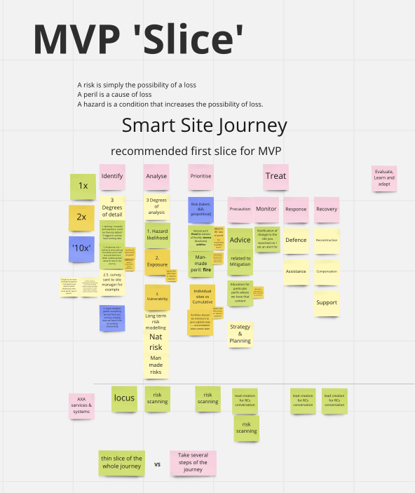
From this workshop we learned a few important things; We knew was that the user would have to be able to monitor their sites, be alerted when a live event was happening, give out mitigation advice if a live event was affecting their site, and then how to prevent this risk in the future.
The workshop also helped us decide on some features early on and create a strategy plan.
The workshop also helped us decide on some features early on and create a strategy plan.
Once we created this plan and had decided the features we started preparing for our pitch to the client.
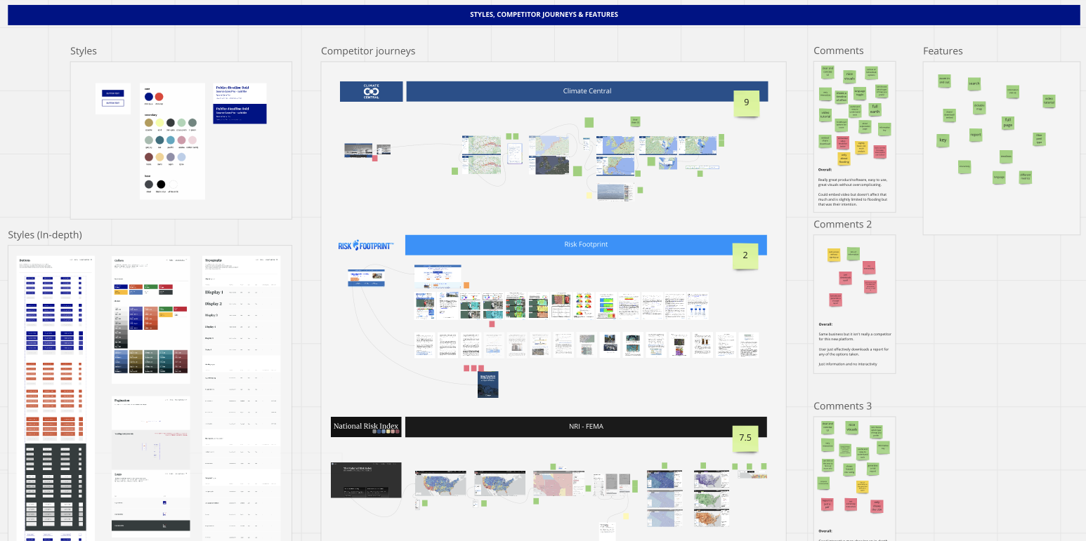
The other two members of the team worked on the 'MVP Slice' and I started doing some research into what was currently on the market both visually and competitively whilst also designing some slides for a pitch deck.
The other two members of the team worked on the 'MVP Slice' and I started doing some research into what was currently on the market both visually and competitively whilst also designing some slides for a pitch deck.

PROCESS
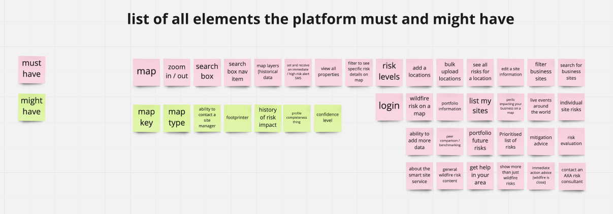
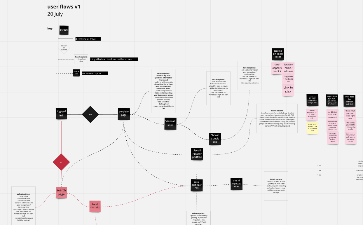
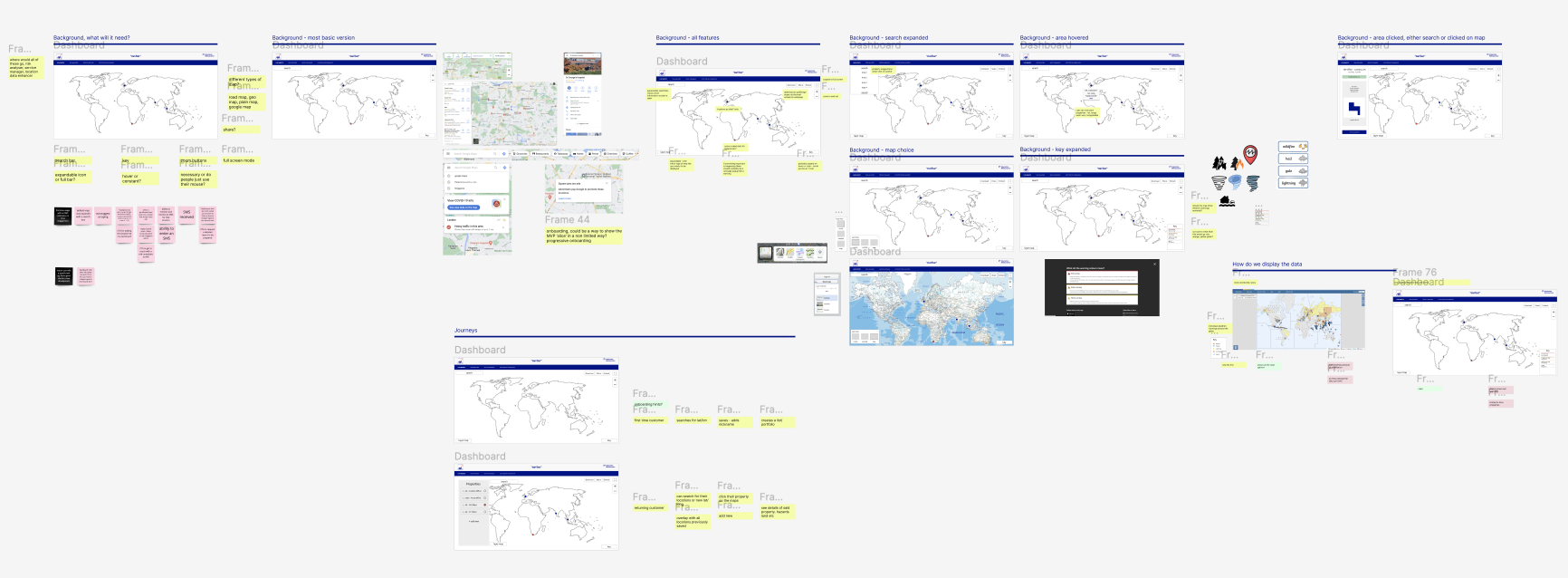
User Flows, Features & Wireframes
After AXA had given us the green light to go with our decided plan of action and MVP so our next step was to have a look at some user flows, a larger look at the features and then wireframes.
.png)
Once the user flow, features, pages and all the page content was mapped out, we began to look at some very early wireframes of what this concept/platform might possibly look like content-wise.
.png)
DESIGN
Moodboards, Wireframes & UI Exploration
My first step in tackling any UI task is the create a moodboard of inspirations found on sites such as Dribbble, Behance and then looking at any competitors or even anywhere that would have a similar feature to the 'smart-site' such as Google Maps, weather sites and basically anything with a dashboard.

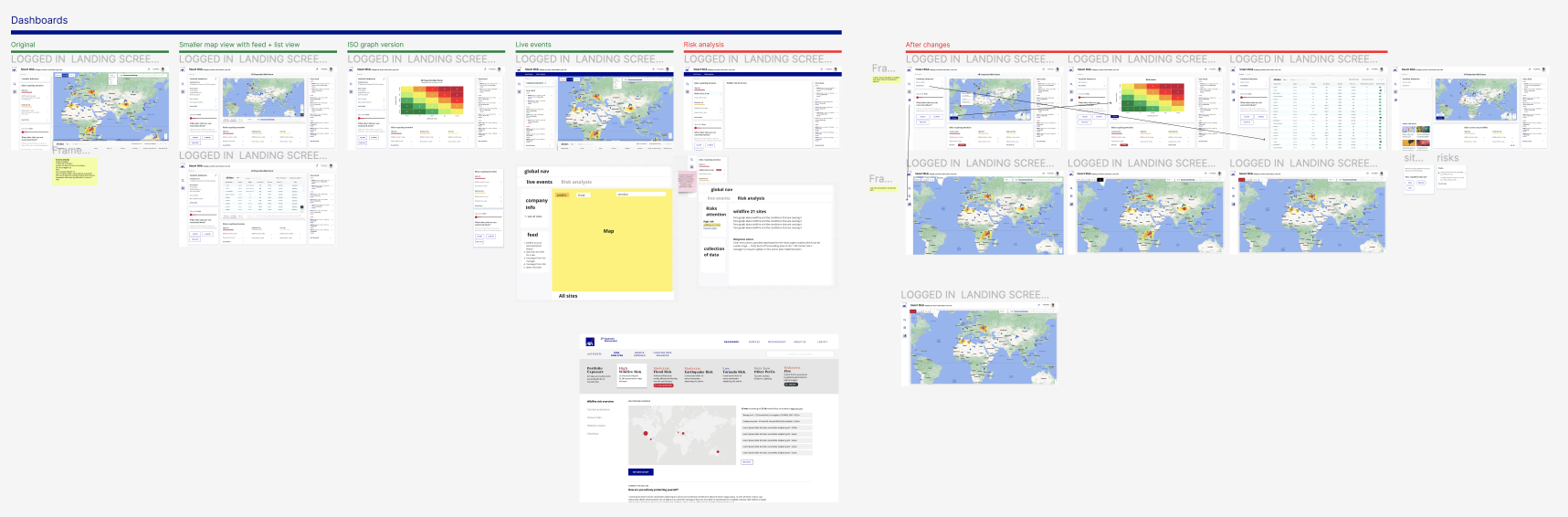
During this whole process, there was still a lot of debate around what the end product would be, would it be a dashboard, would it be a map, would it be something as simple as an alert and the user has to download a report? For this reason we went through many round of design and research.
DESIGN
Version 1 - Map based
The structure of the project ended up being, we would create our idea of what the 'best version' would be and then go through rounds of very casual user testing to see how it was received and to find out more about the client themselves and what they wanted to see on their ideal platform.
Version 1 was very much designed around the idea of being able to explore your sites on a map where you would be able to click into your sites and get advice on how to stop the site being damaged both live and in the long term.
This version was almost a desktop app with a side navigation and the pages split into three columns.
The first key page of the app was a 'Live' section where the user can look around their locations freely and see any live events happening at the time.
The user would then click through to get to 'My Sites' where there would be a news feed, a map of their location that they would have to save to their portfolio, all the site details and then they would also be able to see any long term risks in this area along with mitigation advice on how to prevent this.
.png)
We now had a prototype to test out in our first round of user testing.
TESTING
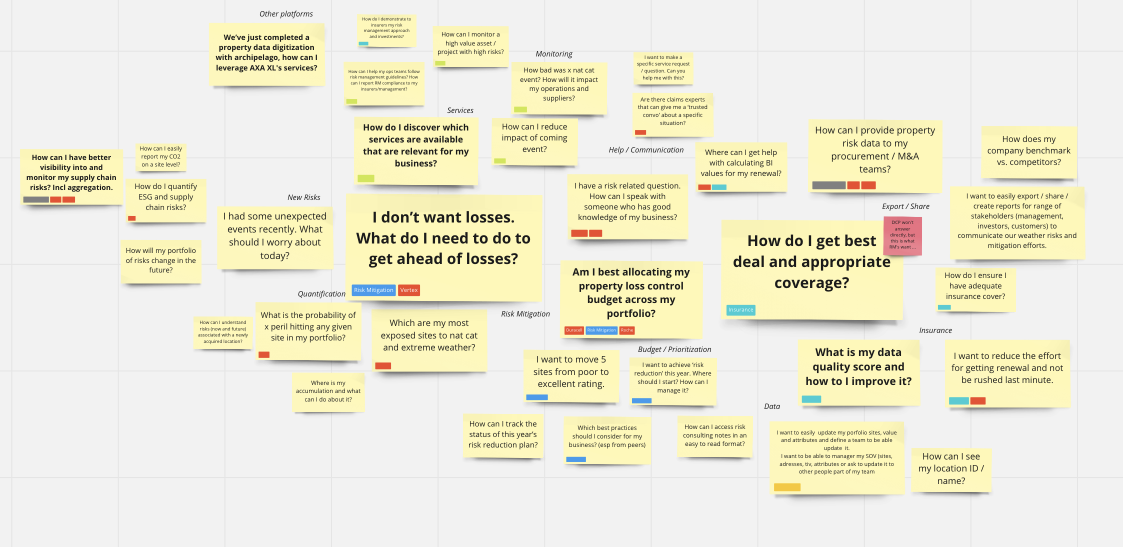
User Testing in Figjam
The user testing was a very relaxed and open ended 'no right or wrong answer' session with some existing customers with AXA XL in the Risk Management industry.
The first 20 minutes would be able their role, how they currently handle risk management and then what they would like to see in an ideal world.
The first 20 minutes would be able their role, how they currently handle risk management and then what they would like to see in an ideal world.
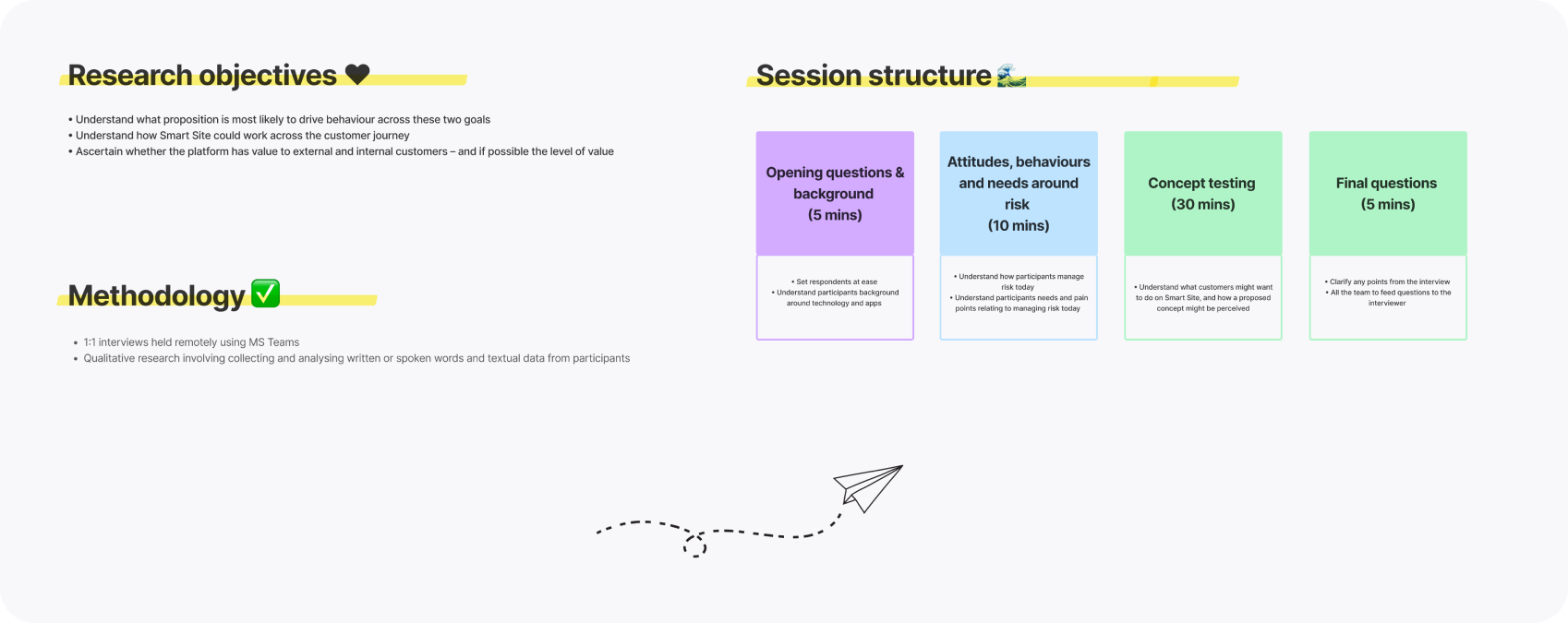
In the second half, we would share the prototype and allow the user to explore the prototype whilst also asking questions on the way about their experience and what else they would like to see.
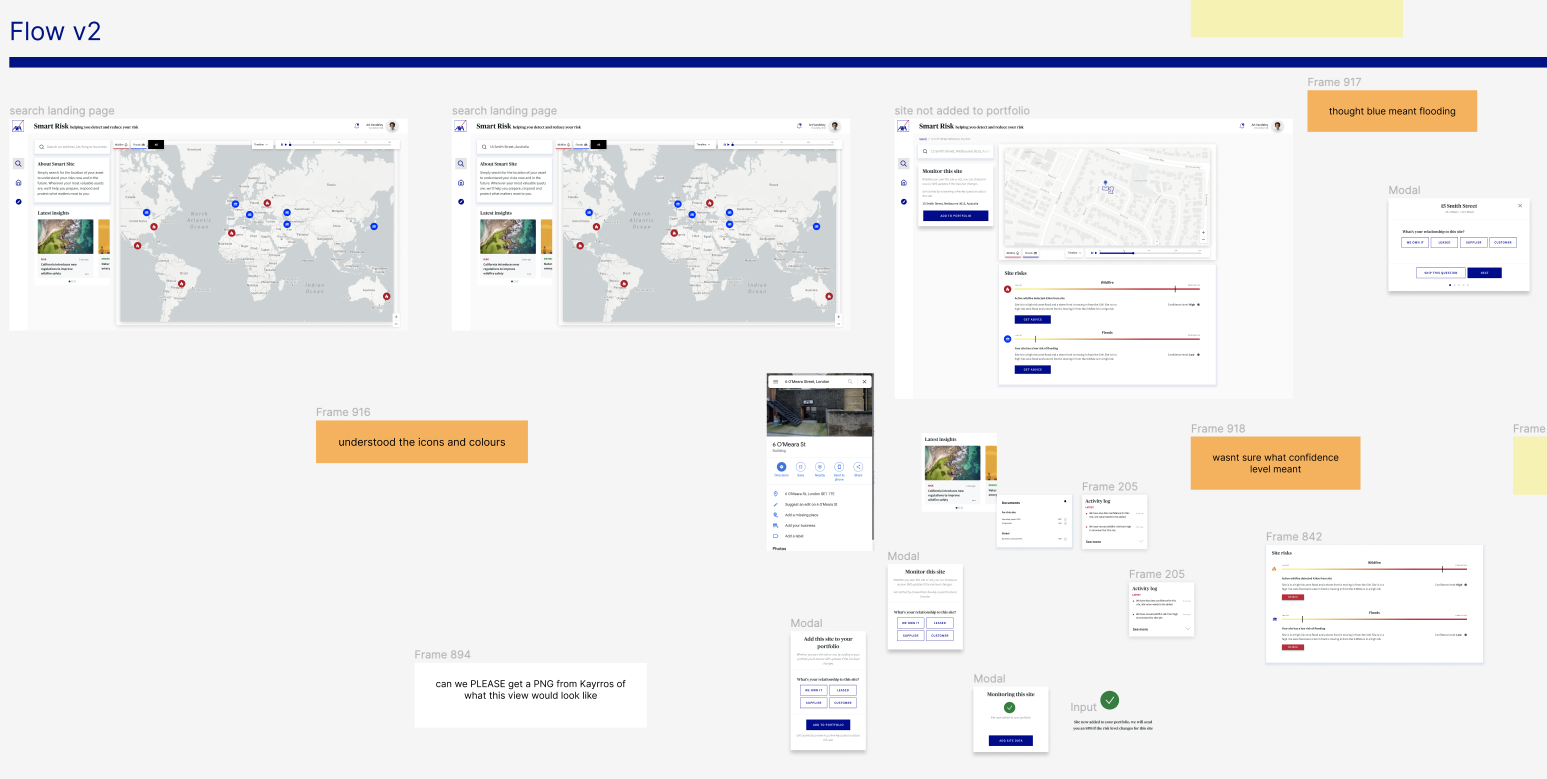
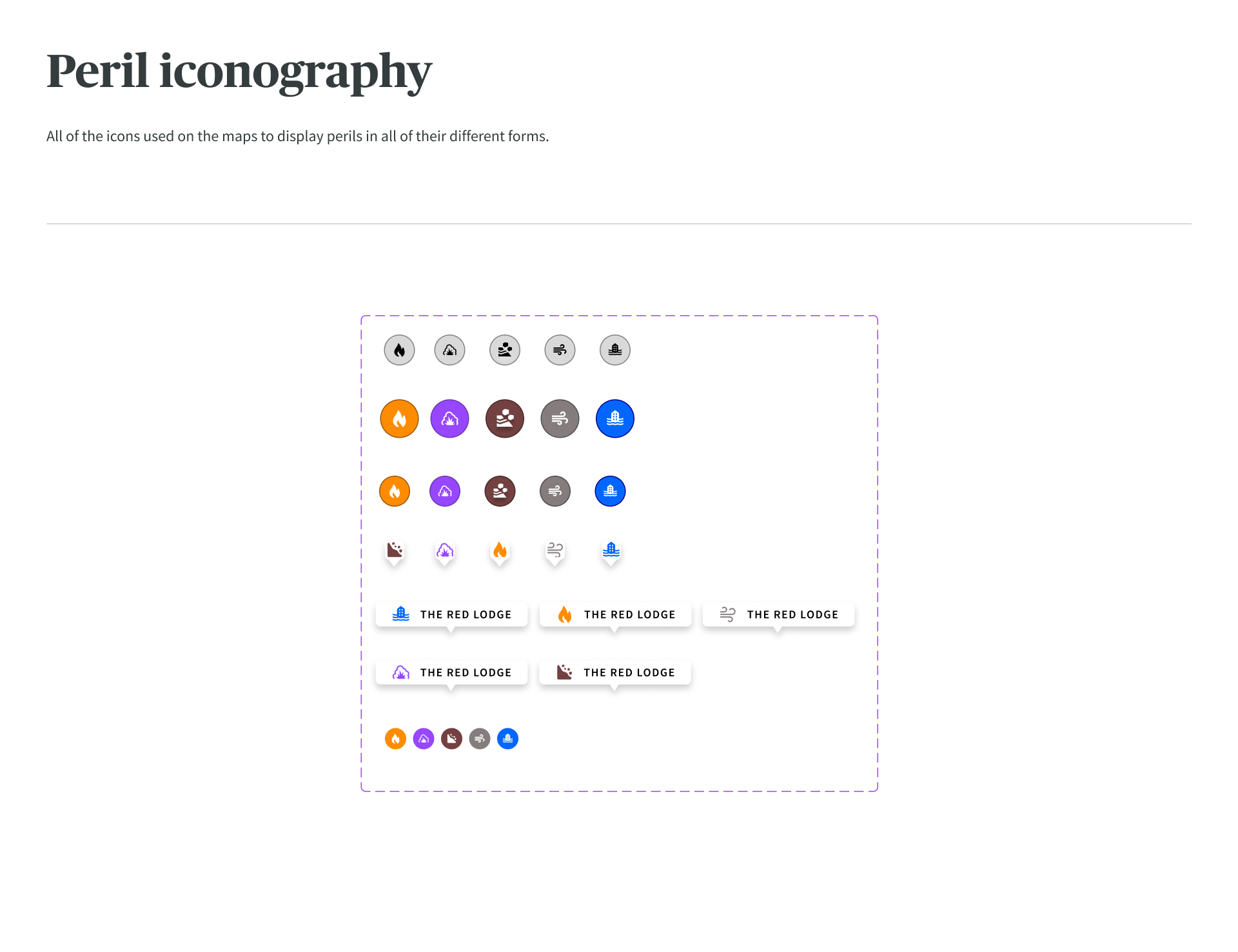
A big issue in this industry is separating 'live events' and 'long-term risk' so this was a big challenge in the UI with iconography, colours and copy.
A big issue in this industry is separating 'live events' and 'long-term risk' so this was a big challenge in the UI with iconography, colours and copy.
DESIGN
Changes after research and Version 2
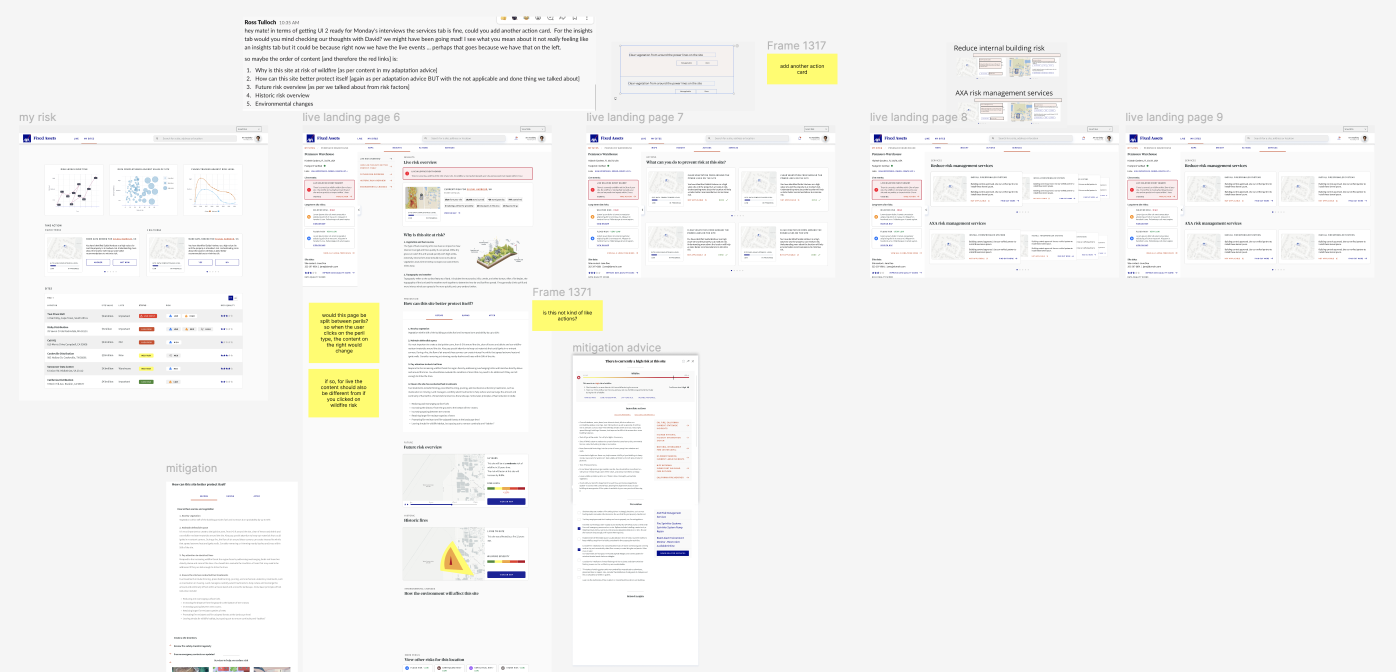
After the first round of research and testing, I was given the task of summarising the changes needed to be made and then make these for a version 2 on Figma.
I also started to check out how the application might look on mobile in case there would be any blockers with the current design in the future, even though the project was supposed to be a 'desktop-first' application.
I also started to check out how the application might look on mobile in case there would be any blockers with the current design in the future, even though the project was supposed to be a 'desktop-first' application.
.png)
The image above is the file with all the changes and down below is how each section was structured. These would range from simple comments about mixing up blue colours for icons with flooding risk (like I mentioned earlier), all the way to exploring the use of ISO graphs instead of maps and creating a whole new 'Explore' page with insights.
.png)
.png)
We also decided to step away from the desktop app, three panel version to a new idea that might be more familiar to the use of having two columns, the left for information and right right wider one with the map.
Keeping everything within 1200px would help the task for both us and the developers when designing for different screen widths.
Keeping everything within 1200px would help the task for both us and the developers when designing for different screen widths.
.png)
TESTING
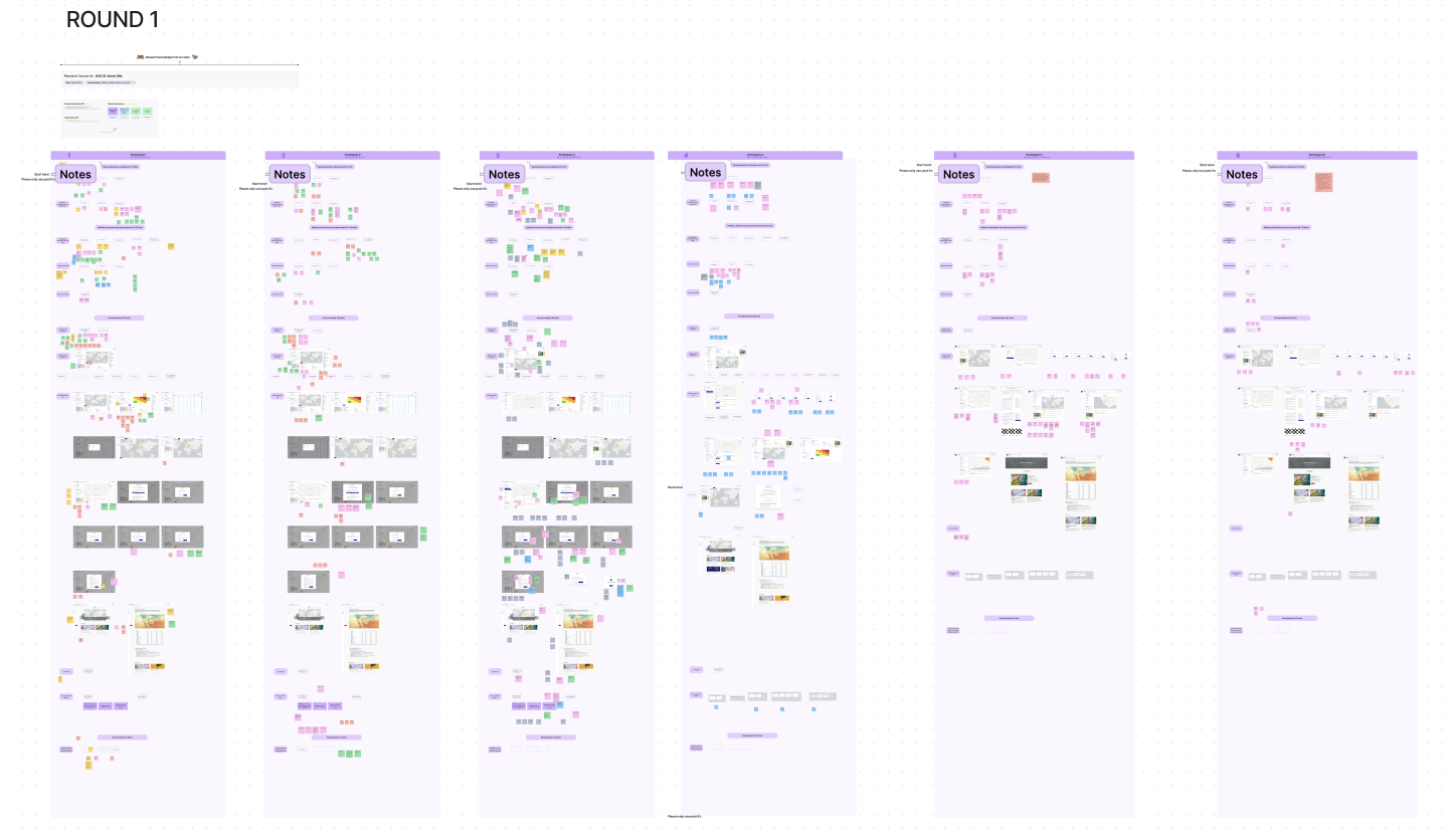
Testing round 2, collecting insights in Notion
Once these changes were made, we went through another round of testing, this one slightly more based on the concept rather than general information from the user.
After the interviews, we compiled all the useful information and grouped it together in Notion, basically in a big database to make it clearer for us to understand all in one area.
After the interviews, we compiled all the useful information and grouped it together in Notion, basically in a big database to make it clearer for us to understand all in one area.
.png)
.png)
DESIGN
Final UI (I promise!)
We started to see some themes within the testing, one huge one was that the main reason these customers would want to use the platform, was to mitigate and prevent risk to their locations (makes sense right?).
We came up with the idea of having some tabs once the user gets to the site level, replacing mitigation advice as a whole, we now had 'Insights', 'Action' & 'Services' tabs so the user could decide what they wanted to do to prevent risk in the future as well as if there was a live event happening at that moment in time.
We came up with the idea of having some tabs once the user gets to the site level, replacing mitigation advice as a whole, we now had 'Insights', 'Action' & 'Services' tabs so the user could decide what they wanted to do to prevent risk in the future as well as if there was a live event happening at that moment in time.
We also came up with a 'My Risk' page which consisted of a more data driven page for those less worried about being able to visually see their locations on a map.
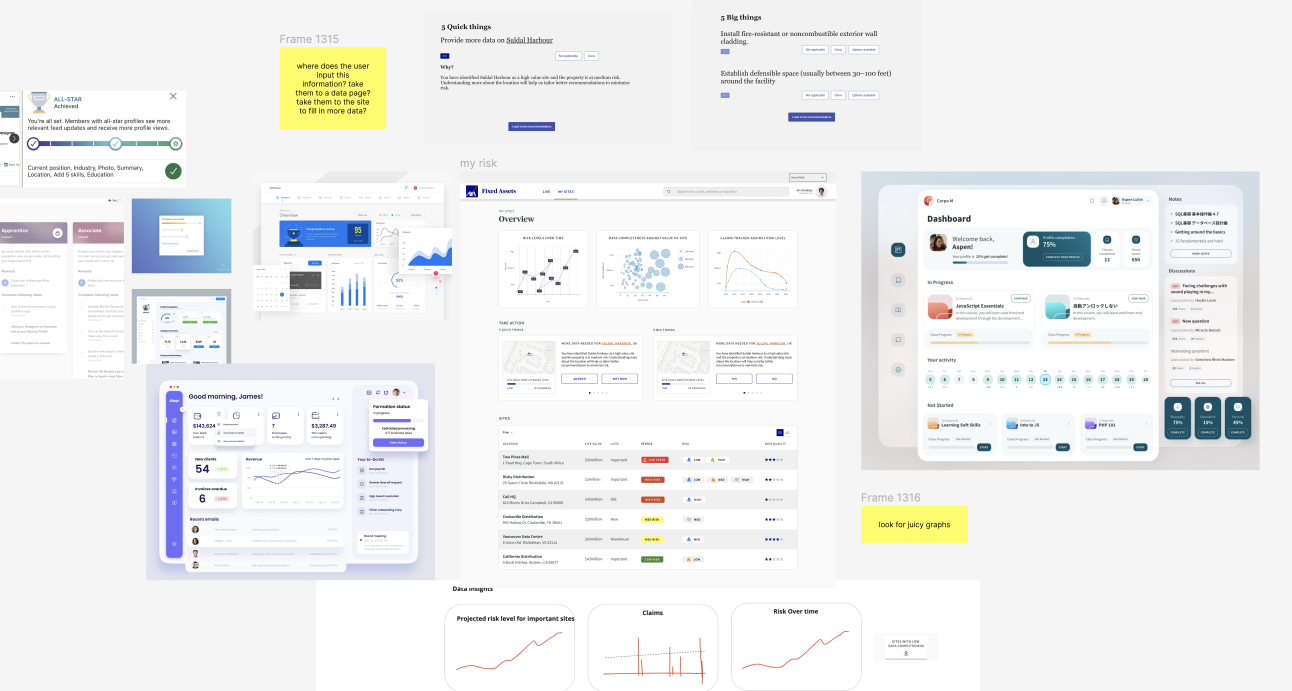
.png)
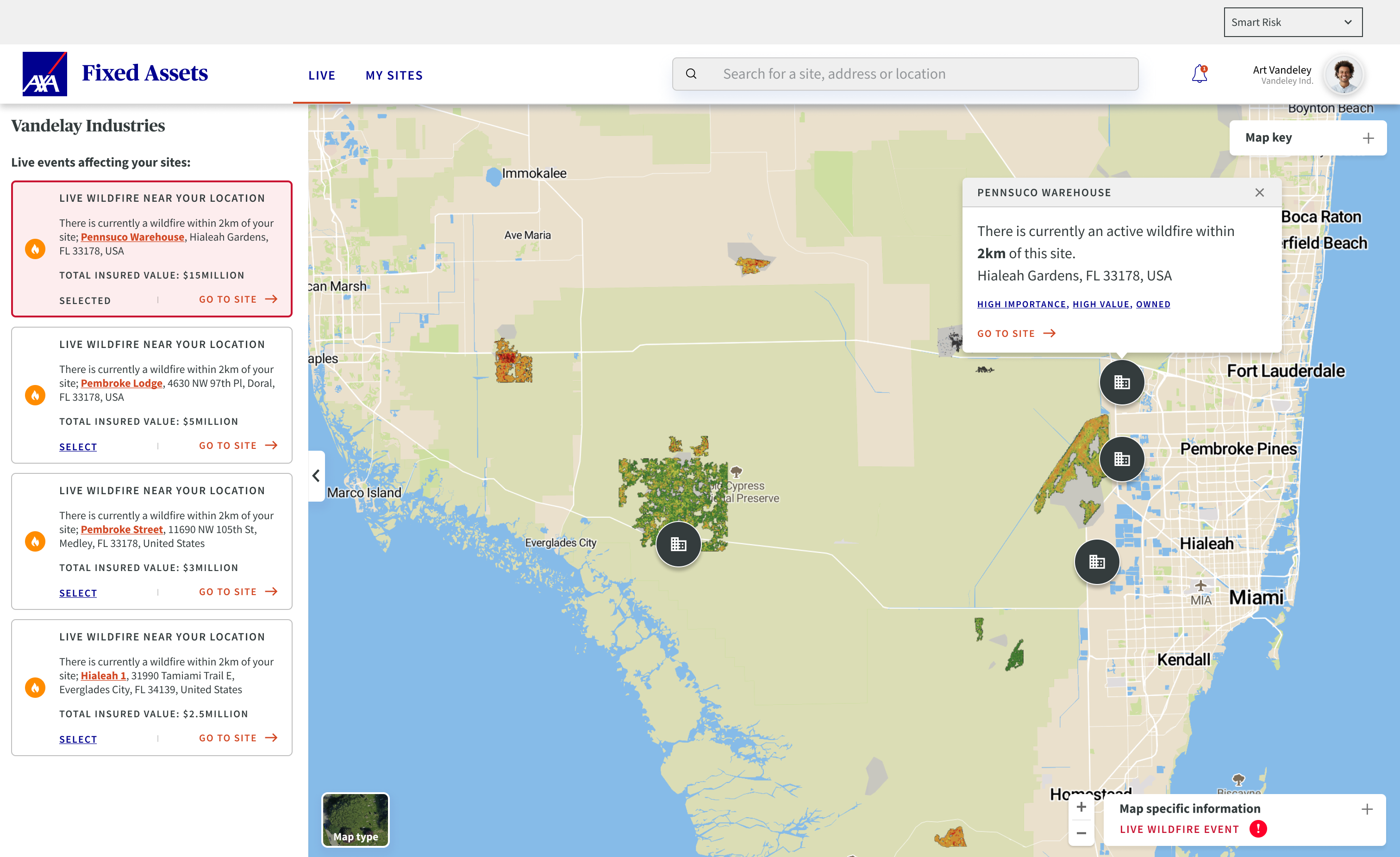
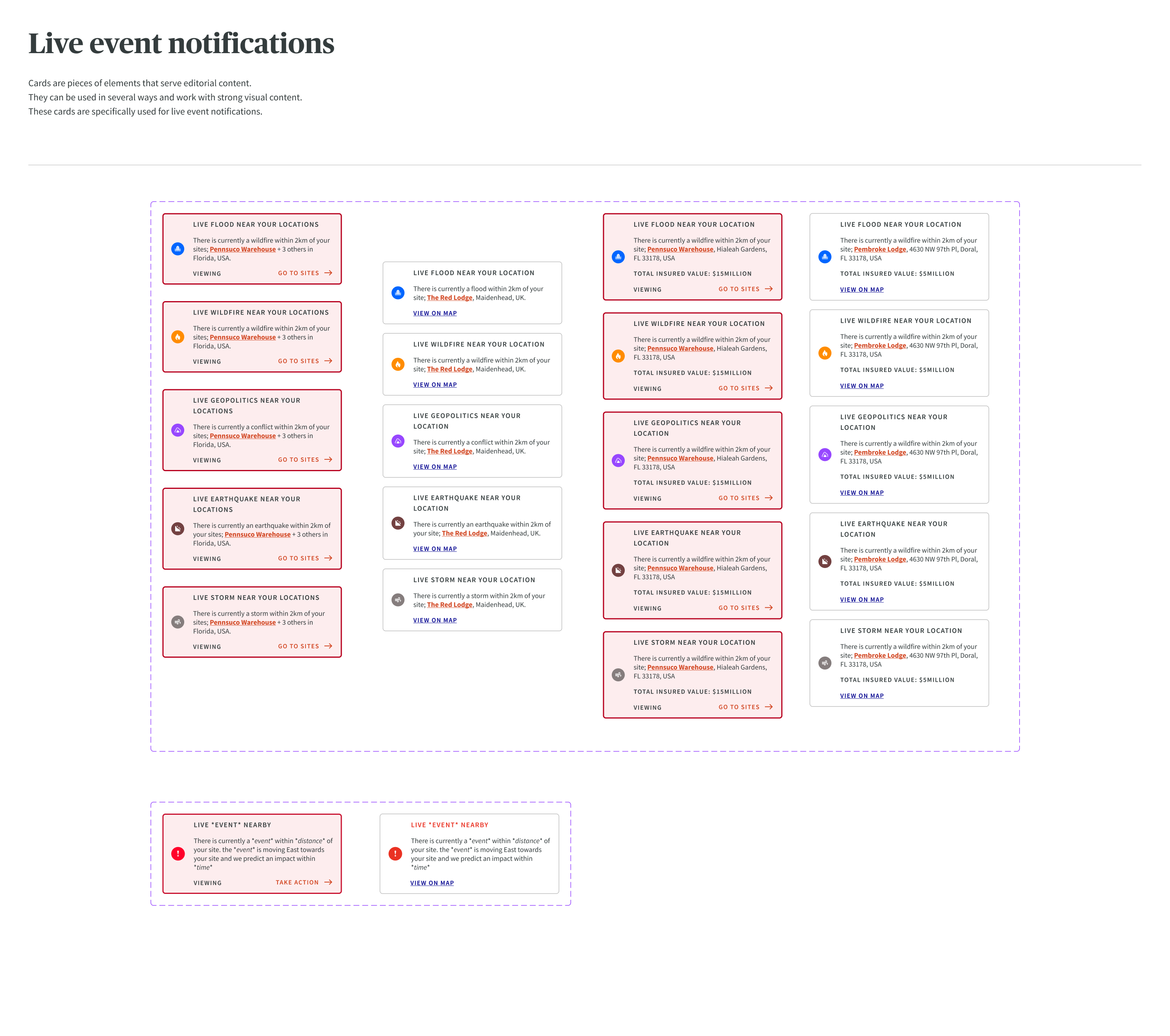
The user would now land on this 'Live' page when entering the site. The page would display any location they have that is in the proximity of a live event.
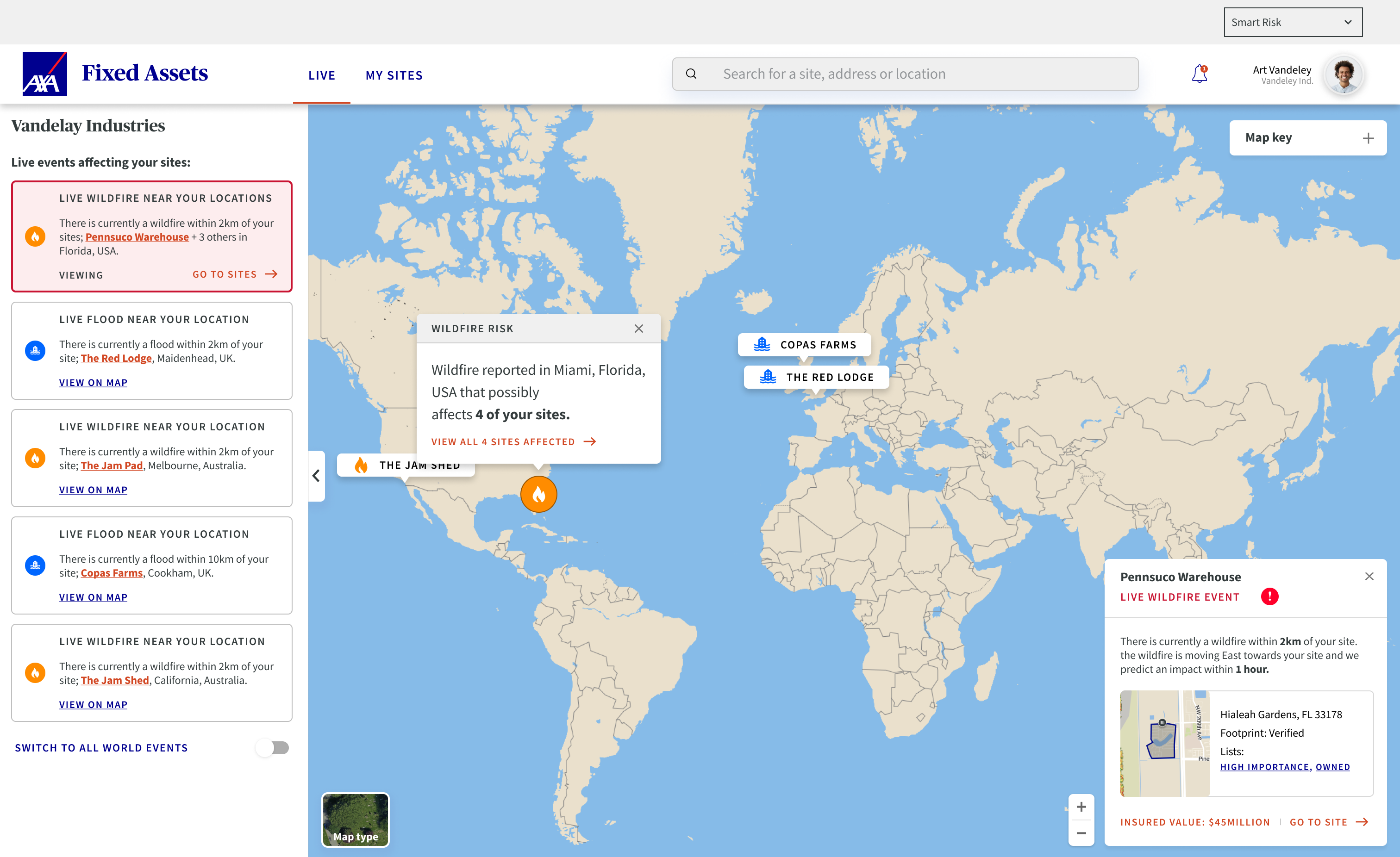
They would be able to switch between all world live events with a toggle underneath their locations.
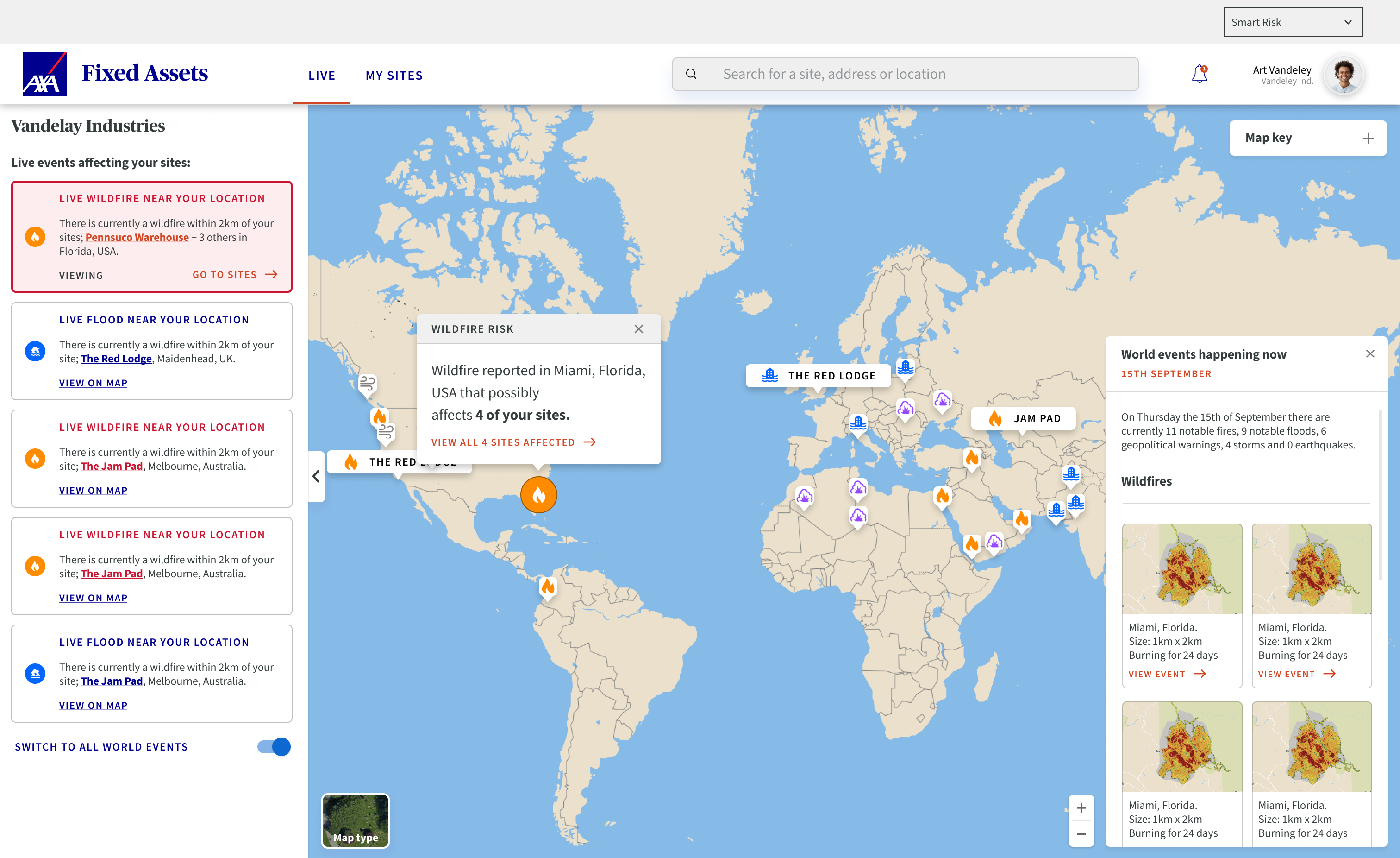
If the user has more than one site affected by this live event, they can click through to see all the sites affected, basically seeing a more zoomed in version of what we currently have.
Some key takeaways from interviews on this page here include; customers really wanted to see what the TIV (Total Insured Value) of a site would be before having to click through.
The icons for the locations are a grey colour so there is no confusion between peril and property, as this was such a big aspect we have also included an icon of a building to minimise confusion.
We came up with an idea of 'tags', this is like creating a playlist on Spotify to make it easier for the user to search for specific locations such as High Importance, High Value and Owned, this is because some people were in charge of over 2000 sites.
Next we get to the site page, this is where the magic happens.
Here is where the user can see their location on a map with the current live risk displayed.
From here the user can switch between long term risks split between each peril along with a live event if they are unfortunate enough to have one currently at their location.
Here is where the user can see their location on a map with the current live risk displayed.
From here the user can switch between long term risks split between each peril along with a live event if they are unfortunate enough to have one currently at their location.
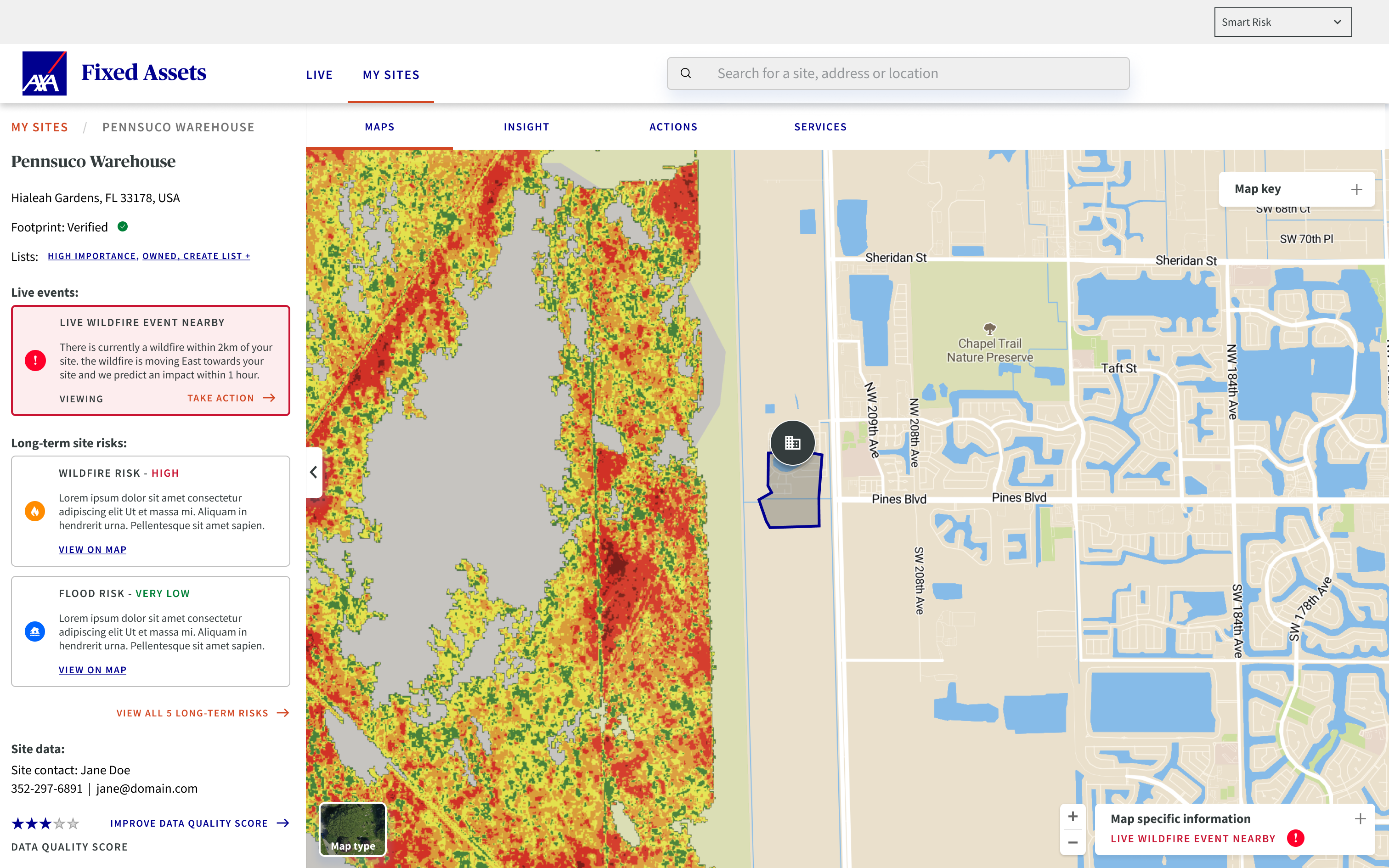
Here is just a version of the site level with all the components set to open instead of closed.
.png)
This is the long-term wildfire risk in this area. The map looks pretty daunting but this is something risk manager would be used to seeing.
.png)
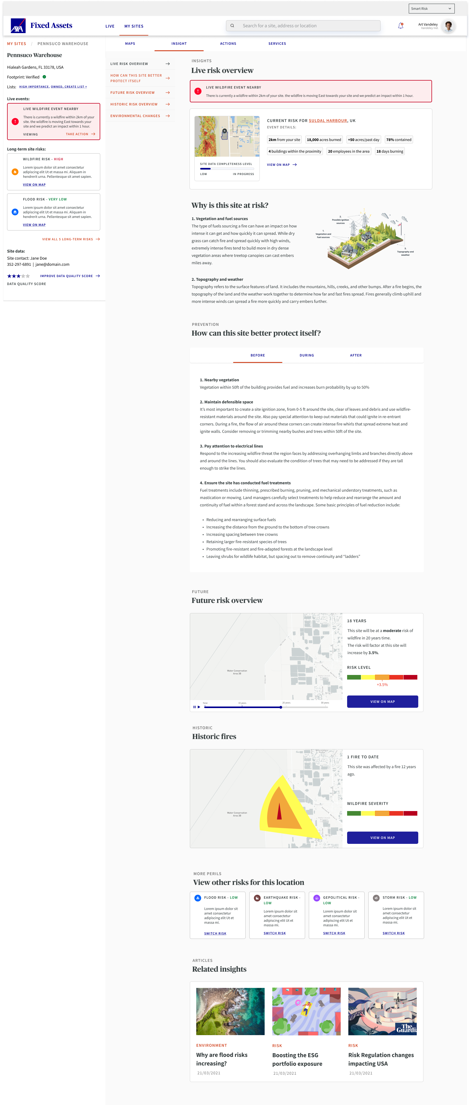
From here the user can go to 'Insight' and have a deeper look into the data.
This is arguably one of the most important pages of the sight, most of the interest whilst taking the user interviews was shown here.
They can see a live risk overview, mitigation to better protect the site in the future, a future and historic risk overview and then some related insights along with switching to different perils.
The user can click on the search bar at the top to find any site they might own or might want to have a look at. This is how the user would find a new site to add to their portfolio.
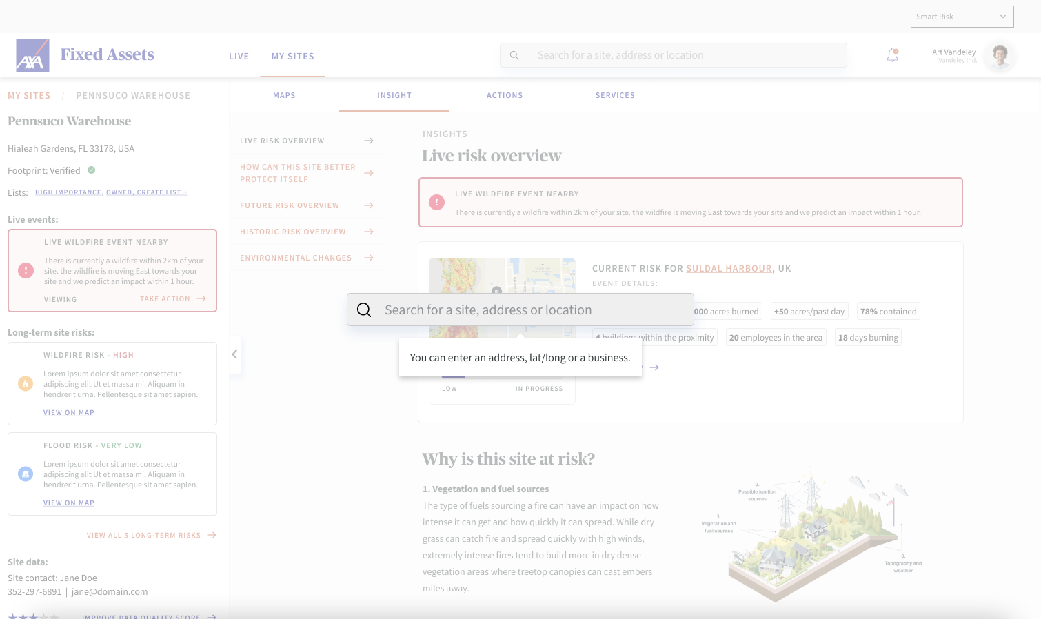
They would then be taken through a series of modal questions if they wanted to improve the data quality score, this helps AXA make a more accurate prediction of future and current risks to their locations.
These questions would include, importance to business, total insured value, adding to any list or tag, what their relationship to the site is and if they wanted to set a specific name.
These questions would include, importance to business, total insured value, adding to any list or tag, what their relationship to the site is and if they wanted to set a specific name.
.png)
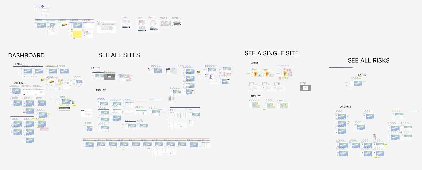
What you're seeing here is the main component variants as these haven't been finalised yet which brings me on nicely to the final section...
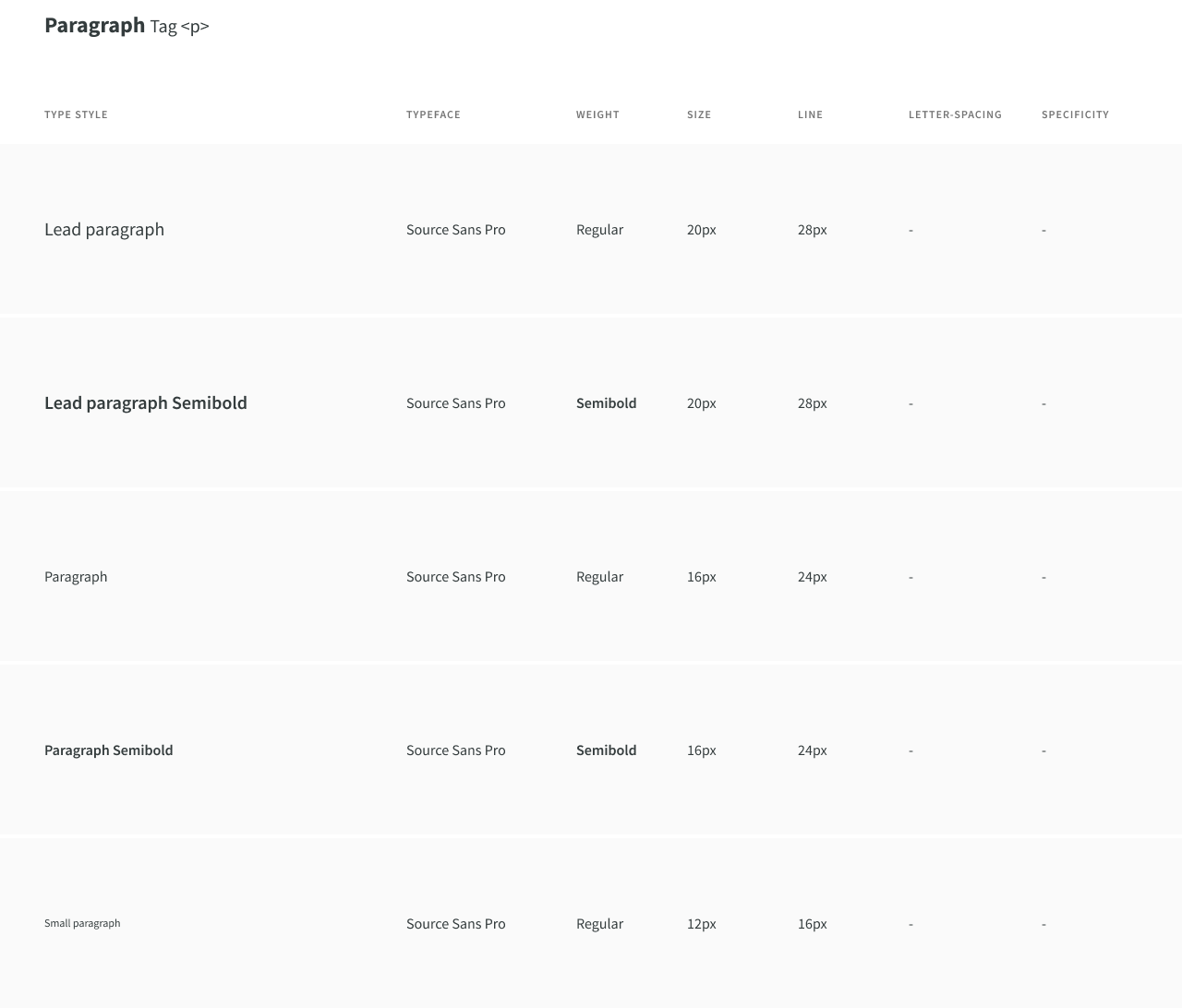
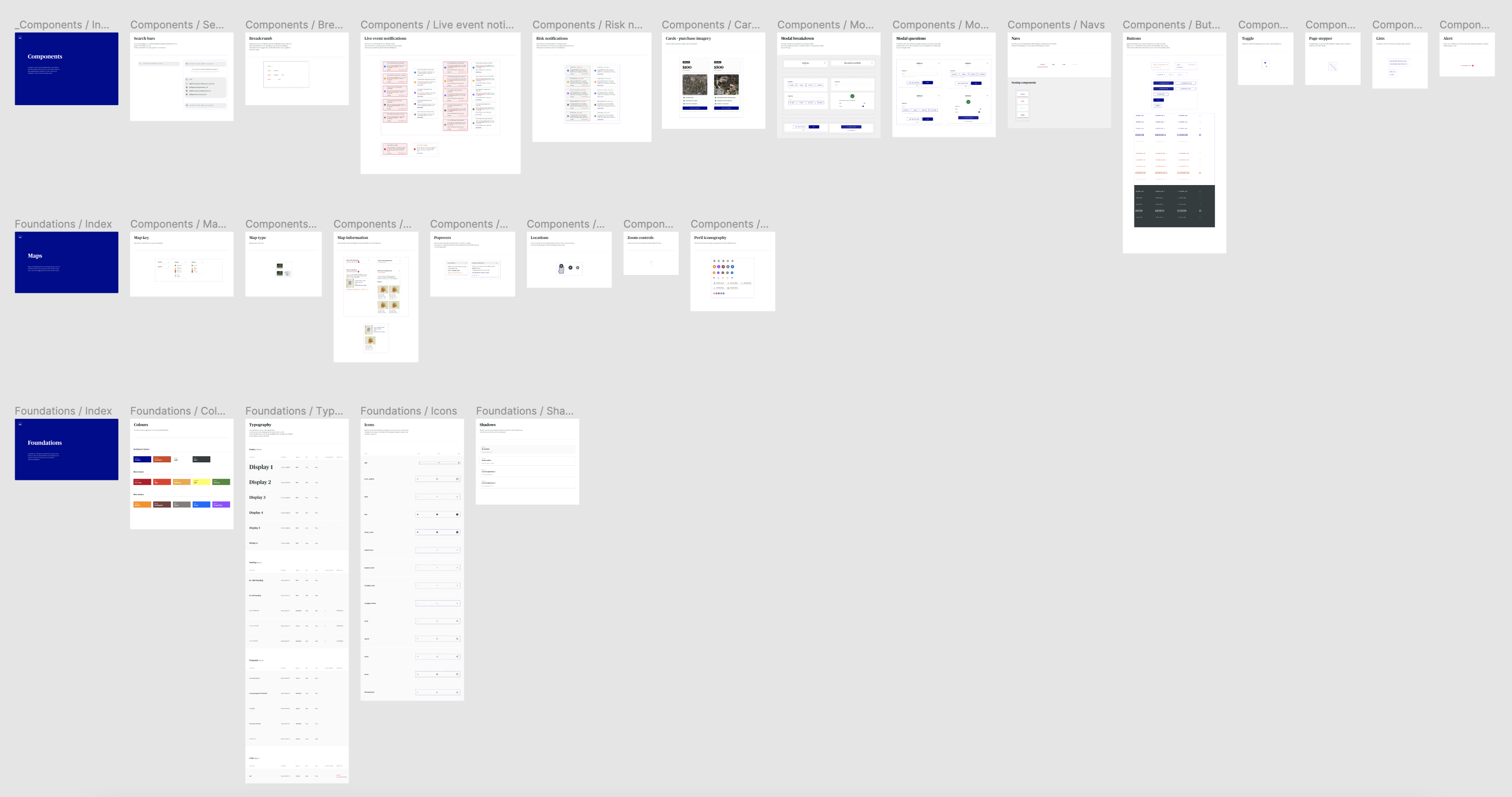
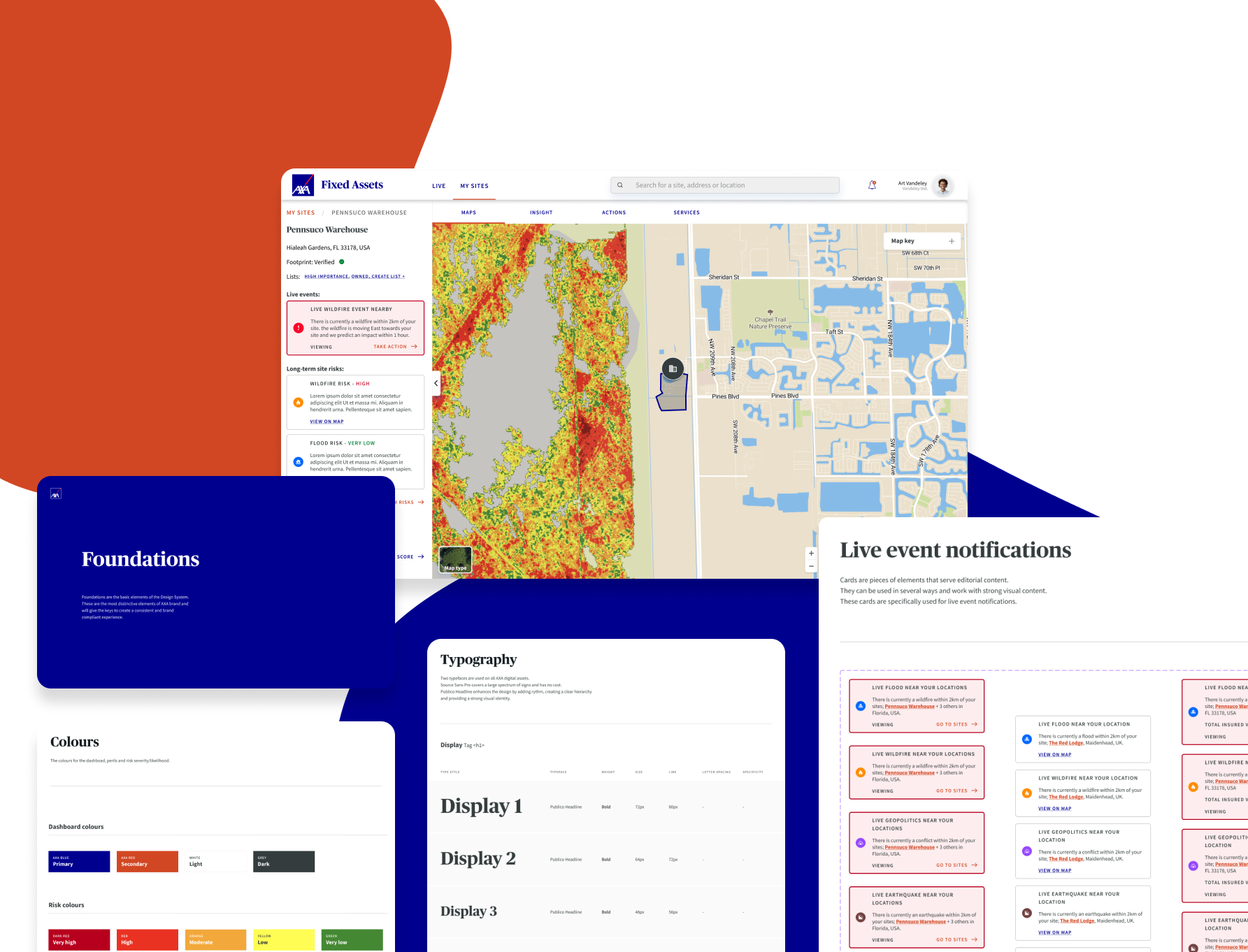
DESIGN SYSTEM
Foundations, Components & Building Blocks
AXA have a UI design system for their current website and some documentation on how to use it but I was given creative freedom to create a whole new library of components as this platform was going to be completely different from anything made before.
I documented components throughout in a messy file as I knew designs would change throughout testing and below is what we had before the last testing period.
I documented components throughout in a messy file as I knew designs would change throughout testing and below is what we had before the last testing period.
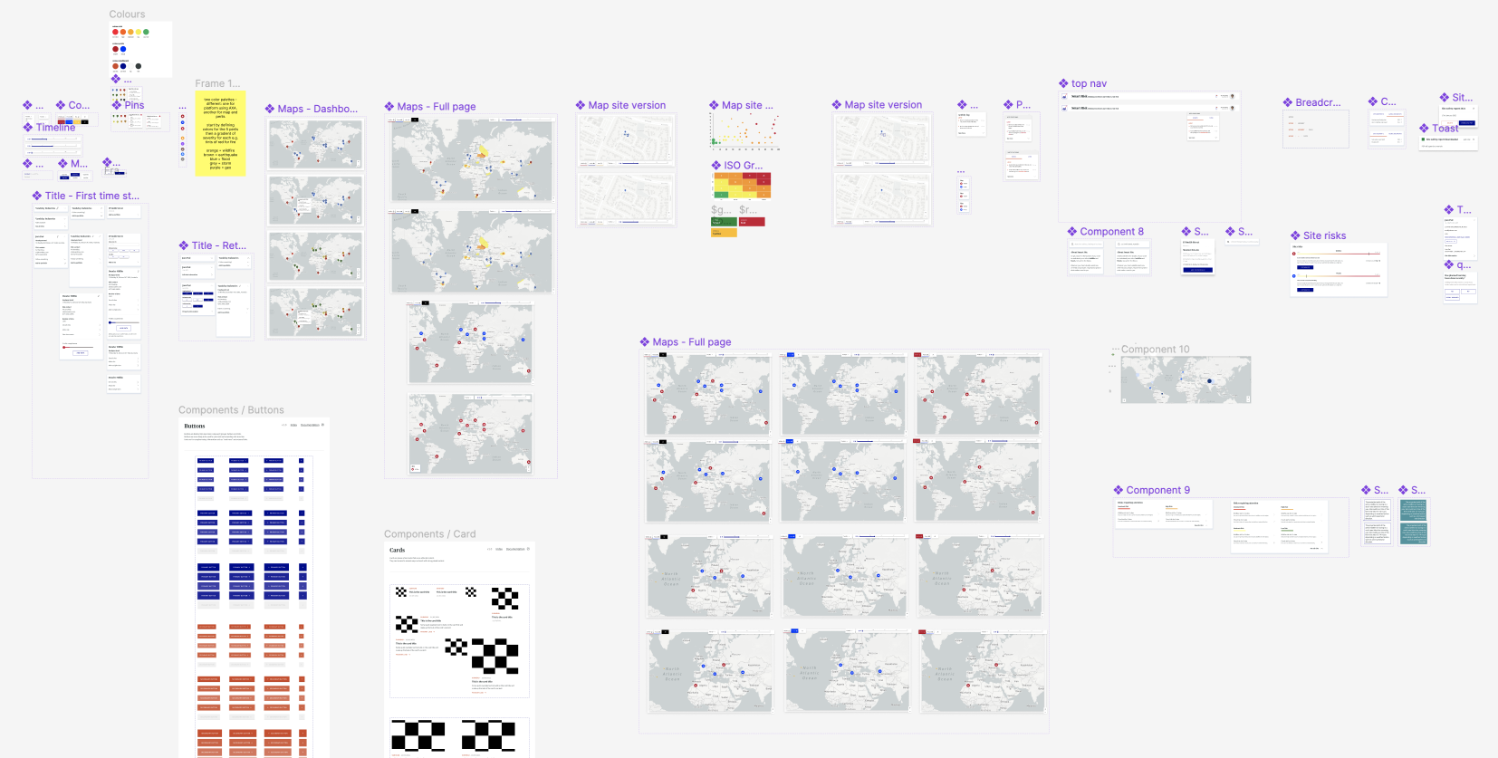
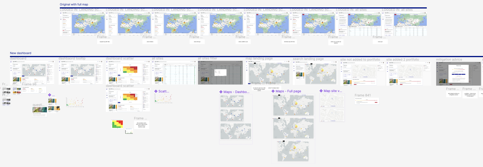
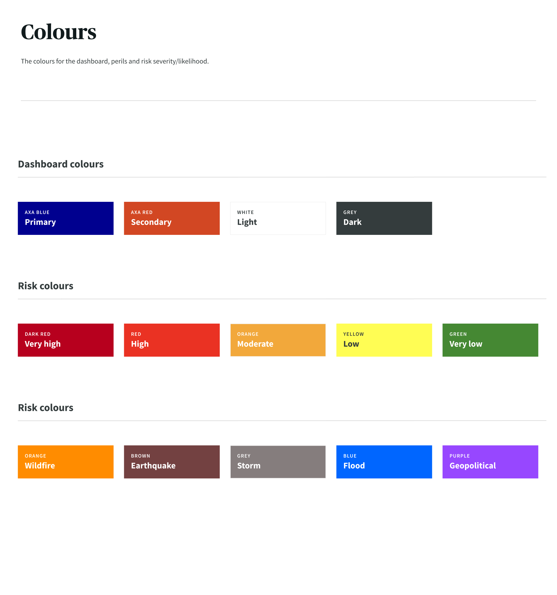
From the old AXA design system we used the typography and the four main colours from their palette along with their base level icons. The buttons and links from their system were adapted into something more fit for our product and everything else was created by me for the purpose of this project.
Foundations
.png)
Map Structure
.png)
Components

.png)
.png)
.png)